University Of Nottingham – Research Strategy
PRINT / DIGITAL / CONCEPT
The University of Nottingham was looking for a sub-level brand solution for its 'Global Research Themes' and 'Research Priority Areas'.
The creative solution was not to be a rebrand and it had to identify with the current recognisable brand style.
There are three design levels that comprise the visual identity for research. These levels are University level, Global Research Theme (GRT)level, and Research Priory Area (RPA) level.
University level uses the clustered pentagon which represents the five Global Research Themes, each has been allocated a colour. This is evident in both the pentagon cluster and in the pentagon outer shape line. The strap-line is 'World-class Research' which simply states what we do at The University of Nottingham. This will always be used with the pentagon at both University, GRT and RPA level.


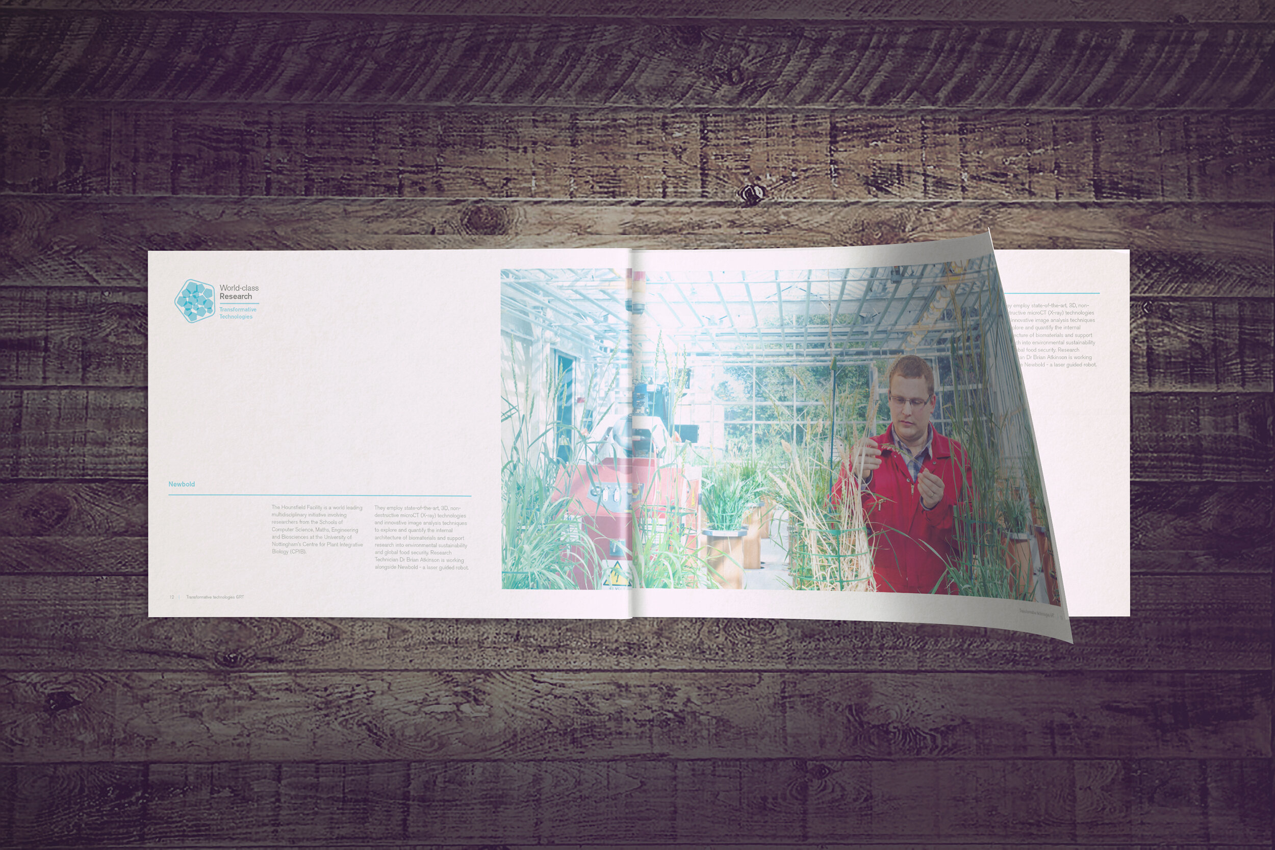
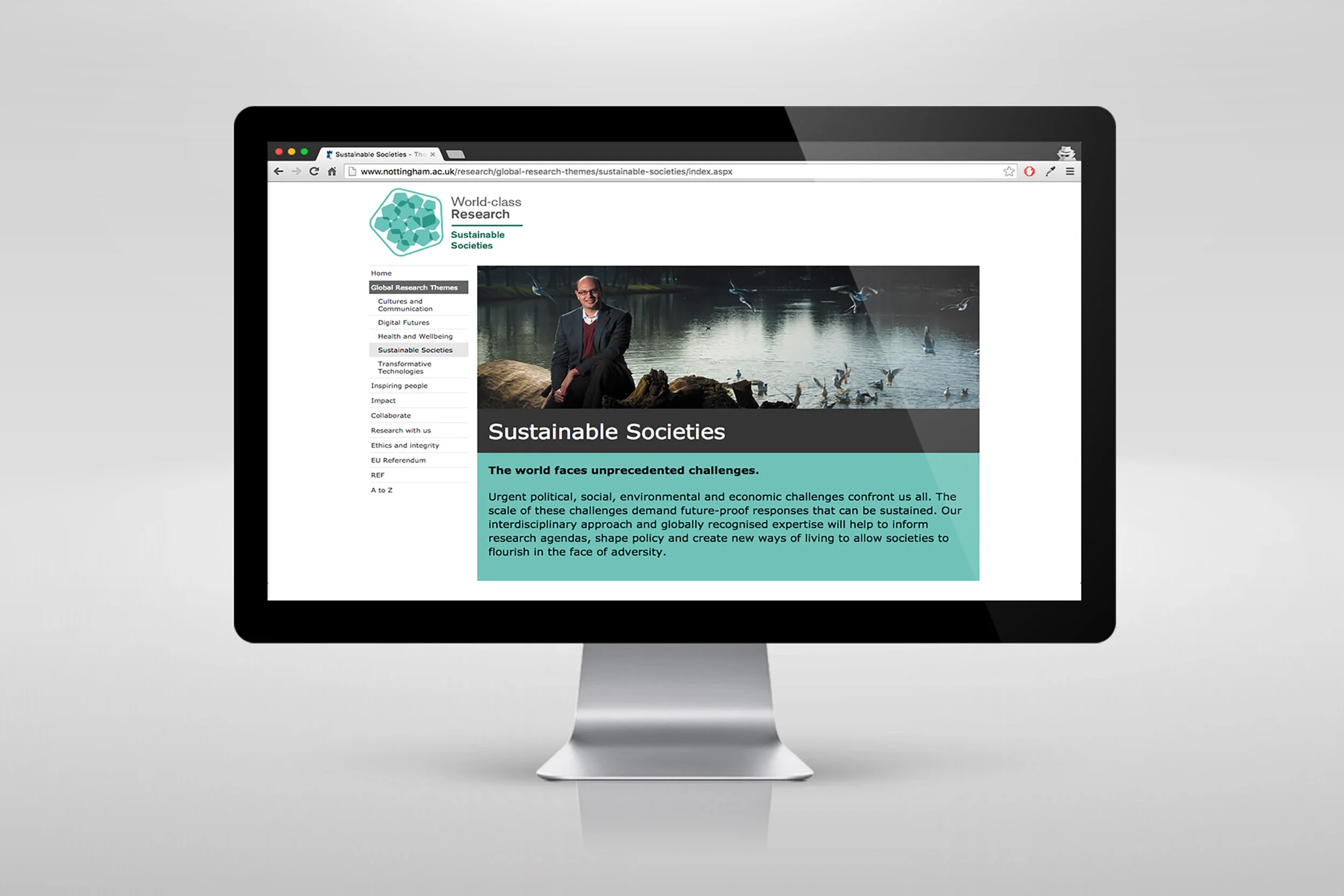
At Global Research Theme level the name of the GRT is used under the strap-line 'World-class Research' to highlight that this is a GRT. This is further reinforced by the pentagon cluster colour which becomes one colour to denote the theme, in this case Transformative Technologies. An added design element of a ‘dynamic’ line in the relevant GRT colour is added, again to reinforce that this is a GRT.


At Research Priority Area level, the name of the RPA is used under 'World-class Research' and both the size and weight of the font has been changed to reflect that this is an RPA. This typeface approach would be consistent on all 31 RPAs. The singular use of the pentagon within the pentagon shape highlights that this is an individual RPA, in this case Marine Economy. The use of one colour highlights which Global Research Theme this RPA is part of. This approach also gives scope to add another pentagon shape and colour to the pentagon if two RPAs collaborate


